MEGA · Web revamp
Revamping navigation for 300M+ users
A year-long redesign of MEGA's web app, taking a cluttered double-sidebar into a scalable bento system, which clarified the navigation, streamlined menus and offerings to align with users’ behaviours, and became the gold-standard for all future redesigns.
Navigation redesign
Web app
UX research
ROLE
End-to-end UX & UI
TEAM
Plus 3 designers I led
TIMELINE
~4 quarters · shipped
00 SUMMARY
A bento system, validated with 338 users and shipped across the product suite.
The Problem
MEGA’s current navigation was illogical, challenging for old and new users to navigate, and had outgrown MEGA’s new product suite. Newer products such as VPN and Password Manager could not be heroed, and usage for common actions remained low.
My role
I led the end-to-end UX, running card-sorting with 338 users, owning the information architecture (IA), and shipping the new pattern across products, while managing three other designers.
The outcome
A gold standard bento-based system which saw engagement increase by greater than two times, while effectively integrating the new 'VPN' and 'Password Manager' tools into the product suite, and retaining 100% of chat usage despite the significant structural change. This user-focused design transformed the customer journey, creating a streamlined and easy solution.
01 problem
Outdated, messy navigation which wasn’t user focused
As MEGA's suite expanded, the navigation didn't keep pace, leaving an experience misaligned with user behaviour.
My initial audit of the web application found the interface had become cluttered with an unclear hierarchy, and non-scalable. This made core features hard to find, and left no space for newer value-add products like 'VPN' and 'Password Manager'. This was confirmed by MEGA’s low engagement metrics, and suggested a more intentional approach was required.
BUSINESS NEED
+20% increase
A scalable navigation system to drive adoption of VPN and Password Manager and increase usage of under leveraged features (Media and Shared items) by 20%.
USER NEED
Clarity
An intuitive structure for both, new and super users, which reduces cognitive overload and makes the path to common tasks easier (reducing the number of clicks).
"I know the feature exists, but I have to click around three times just to find the entry point."
— Super user, on managing backups


02 Exploration
Understanding how users navigate MEGA
Working with an UX Researcher, we ran card sorting exercises across two user segments; super users and new users to understand how people actually grouped and navigated MEGA's products.
7
Moderated card sorting interviews
331
Maze unmoderated responses

Dendrogram based on card sorting analysis
Key takeaways:
01
Photos & videos - treated as part of cloud drive, not standalone products.
02
Contacts, chat & meetings - were all seen as linked, but had separate purposes; users wanted contacts more integrated throughout.
03
Password Manager & VPN - consistently treated as a distinct category, and should remain separate.
04
Dashboard - almost impossible to find; users looked in settings, not under the logo.
This led to two questions which drove our design process:
HMW · 01
How might we redesign the navigation for our users to be clearer, scalable, and future-proofed, such that engagement and usage increases?
HMW · 02
How might we introduce this change without alienating super users’, while still giving newer users a fresh and intuitive design.
Possible concepts
Before settling on the final solution, I explored three concepts, with the key criteria being a scalable design which provided a clean navigation for users.
The first option (top left) was improving the existing double sidebar, this was the least disruptive option, and most similar to the current navigation. However, the multiple active sidebars remained an issue, as it created competing focal points undermining MEGA’s core offerings.
The second option, a simplified top navigation (top right) was also explored, this removed the double navigation bar on the left, but the lack of scalability still remained an issue, as MEGA’s product suite continued to grow, and the horizontal menu left little space for this.
The third option was a Bento menu (bottom images). Although it was the most different from the current navigation experience, it mirrored industry best practices and successfully addresses both MEGA’s objectives and user’s requirements.

Exploration of navigational concepts
The bento menu emerged as the strongest solution, competitor research showed it was the most effective design for large-scale SaaS systems as it allowed for scalability, and it aligned closely with how users had already grouped MEGA's products within card-sorting. Despite it using different architecture, the design was now intuitive, and easy to use.
User requirements met: gives users a clear view of all core product areas, while keeping less-used features out of the way, directly addressing cognitive overload.
Management requirements met: solves for scale, as MEGA's product suite grows, new additions can be integrated without cluttering the interface.

Proposed information architecture for the top level navigation
03 Solution
The chosen design: a unified solution for all
After finalising the layout and structure, I worked closely with the MEGA product and engineering teams to outline implementation, ensuring the design translated effectively within the web app. We addressed edge cases, aligned interactions with user expectations, and ensured consistency was maintained across all products.
The new navigation was successfully released, offering a cleaner, more intuitive experience, improved cross-product discoverability, and reduced cognitive overload. Ongoing feedback loops were also set up to monitor adoption and identify areas for future improvements.
Changes in the overall top and left hand side navigation
Key Changes:
01
Consolidated a cluttered icon sidebar into a bento menu, creating a scalable foundation that grows with the product ecosystem.
02
Media and Device Centre reframed as features under Drive, eliminating duplication, and improving separation between products and features.
03
Repositioned Upload and New folder as the primary “calls to action”, driving daily file uploads from 65,000 to 80,000 per day (23% growth).
04
Collapsible navigation gives super users a larger working area, while newer users retain the full structure until they're ready to adapt it.
Purposeful design decisions for better outcomes
Changes to Account & profile
The previous avatar menu was fragmented, had duplication of account information across multiple menus, and unnecessary clutter with the full sitemap within the product dropdown. The redesign consolidated everything into one focused menu.
Account menus, pre and post revamp
Key Changes:
01
Streamlined the avatar menu, eliminating duplicate actions that were displayed in multiple places.
02
Removed the full web sitemap from the menu, reducing clutter and retaining only key user actions.
03
Dashboard relocated from under the MEGA logo to the avatar menu, aligning with users’ expectations.
Cross-product shortcuts
A collapsible right-hand sidebar gave super users access to contacts, messages, and meetings across all products, preserving simplicity for newer users, while retaining functionality which super users relied on and were vocal about during the research phase.
Contact and chat side panels
Media placement
Research and alignment sessions with Product Managers and stakeholders, supported integrating Media into Drive. I restructured the web Media experience to align with the mobile app architecture, resulting in a more consistent and unified user experience across platforms.
Media sections, pre and post revamp
Key Changes:
01
Removed separate Photos and Videos tabs, introducing Timeline and Albums views with filtering between photos and videos.
02
Renamed the menu from “Photos” to “Media” to more accurately represent the full feature set and match user expectations.
03
Refined the grid layout to enhance image clarity and added selection controls for a more intuitive browsing experience.
Design system alignment
Alongside the navigation system update, ongoing work was carried out to align the web app with the emerging design system. This required early agreement on core foundations such as typography, color tokens, and grid structure to ensure consistency across both the navigation update and the broader web app redesign.
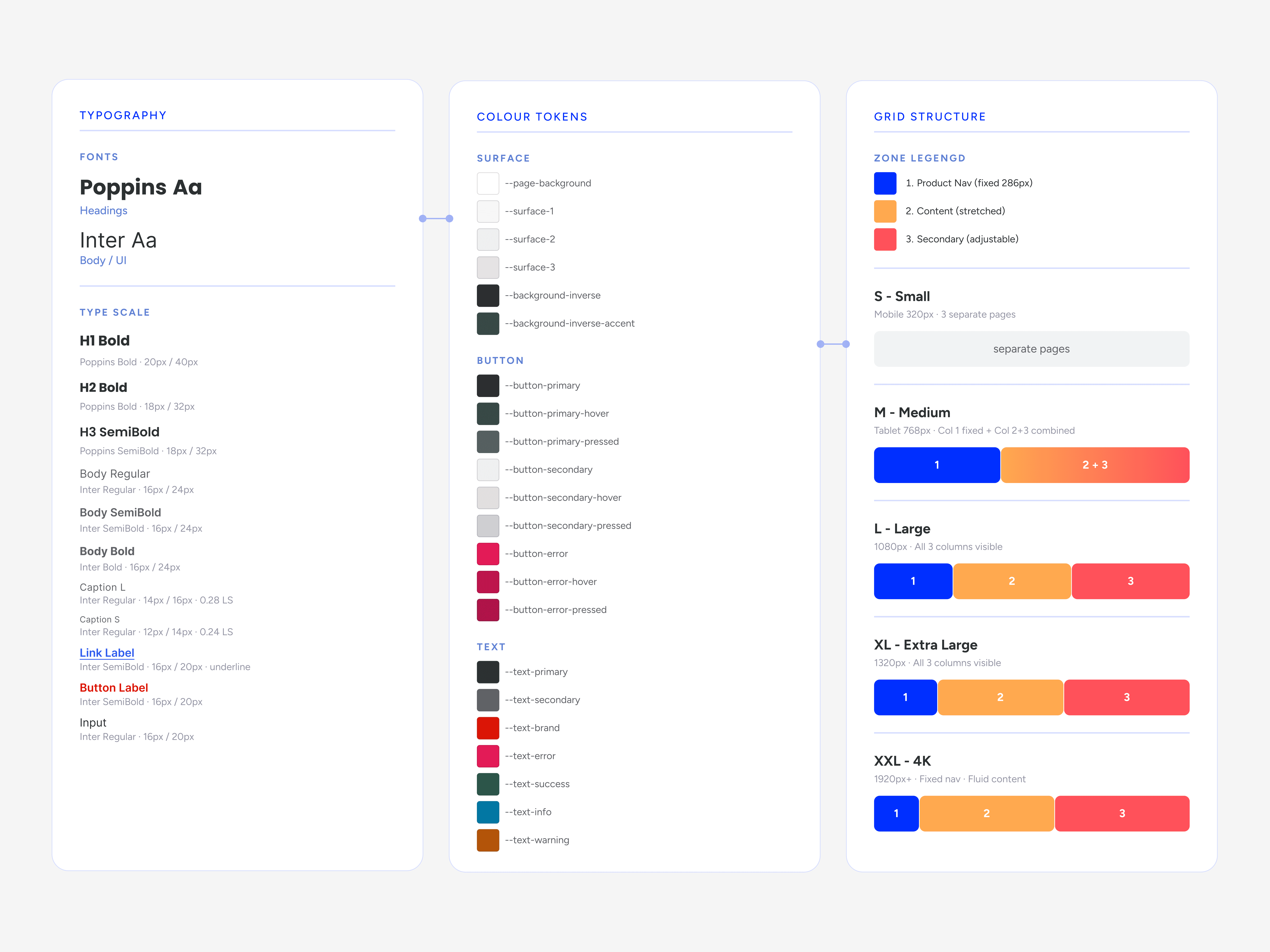
Snapshot of design system
Leading the team
The navigation redesign team ran alongside a broader web revamp including a team of three designers. Over the course of the project, priorities shifted, the navigation work timelines shifted to accommodate the Device Centre launch, and redesigns to both Media and Device Centre were brought into scope and rolled out in phases. This meant the team and I had to be agile, dynamic, and flexible to navigate the increasing scope, change in priorities, and three projects running simultaneously.
As lead, I was responsible for both my own design work, and the overall quality of output across the pipeline; running reviews, maintaining design system alignment, and ensuring the handoffs between engineering and design remained smooth with clear scope. The role required moving constantly between: the detail of my own decisions, and the overall bigger picture of what the team was delivering.

A snapshot of work I owned and led across Q3 2024 – Q2 2025
04 OUTCOME
Design which delivered results, meeting KPIs & targets
The redesigned navigation had a measurable impact across the web app, not just in adoption, but in how confidently users moved throughout MEGA’s product suite, which were previously either, challenging to find, or not available.
+133%
+87.5%
Daily Shared items visits - 16K to 30K
100%
Chat usage retained post - migration


Expanded the ecosystem.
Putting the redesign to the test
A follow-up quantitative survey with 428 users measured pre- and post-launch experience. Both, navigation clarity and visual organisation scored strongly, which were the two key goals of the navigation project, this gave MEGA management comfort that the core redesign decisions had landed.
The UMUX-Lite score moving from 76.5 to 83.25, a C to a B, confirmed we'd uplifted the experience for both new and super users in the process. Alongside this, we also identified further issues around task efficiency, which uncovered that the new navigation structure was right, but the workflows sitting inside it still needed attention. This insight led the next phase of the navigation project.
UMUX-Lite score · pre vs. post launch
PRE-LAUNCH
76.5
GRADE C
POST-LAUNCH
83.25
GRADE B
The UMUX-Lite is a two-question survey that measures how easy and useful people find a product, generating a normalized score from 0–100. A 6.75-point gain at this scale is meaningful, and this was consistent across lift held for both segments we'd been designing across.
"What stands out most is navigation - the new menus make it easier to access the features I need, saving tons of time. I no longer have to Google instructions each time, because that feature was buried within the menus."
— User on the new MEGA navigation
05 Learnings
What this taught me
What I'd do differently
Start the design system and planning earlier
Building the new navigation while the wider system evolved created rework across the three designers. Earlier mapping of interdependencies and coordinated planning of both streams could have helped avoid this.
Align requirements across departments
Despite there being a clear understanding of user expectations, there was still ongoing back-and-forth between design and PMs which caused delays. In hindsight, involving PMs in the research phase would have ensured earlier alignment between product direction and user expectations.
What I'd do AGAIN
Segment users from the start.
Treating super users and newer users as distinct audiences gave us a cleaner brief and the UMUX gap became our clearest measure of progress and success.
Designing to research.
The Bento design was specifically built to align with real card-sort behaviour. This meant delivery and adoption was smooth, because we gave users exactly what they wanted.
NEXT CASE STUDY
MEGA PASS
Launching a password manager across 4 platforms in 12 months
Led end-to-end UX and UI for MEGA Pass, a privacy-first password manager designed across web, browser extension, iOS, and Android. Grounded by research with 800+ users and launched within a one-year roadmap.
